
Vesper Tea
Project: Vesper Adaptogen Cocktails
Role: Brand Identity & Packaging Design
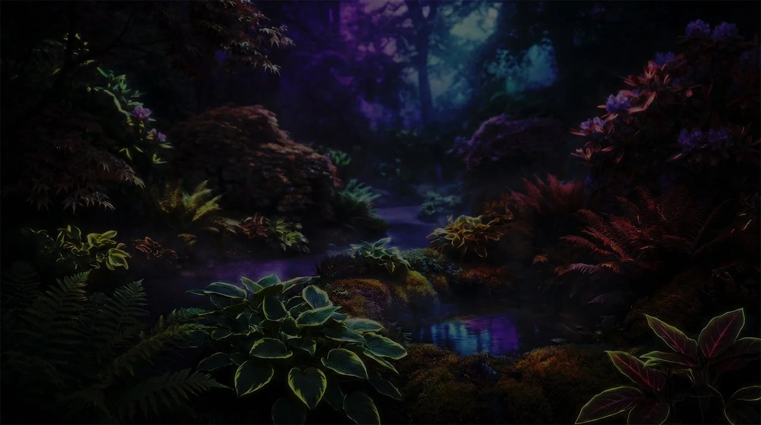
The Challenge: Wellness drinks are designed to fight for attention—bright colors, loud shelves, morning energy. Vesper doesn’t play that game. It lives in the golden hour, in nightlife, where presence matters more than volume. It doesn’t beg to be seen—it sits back, quiet and confident, knowing it will be chosen.
The Solution: I developed the "Ethereal Noir" aesthetic: a design system that pairs tactile, matte black aluminum with shifting iridescent foils. The packaging challenges the category norms by using darkness as a canvas, utilizing high-luminance "bioluminescent" typography to ensure legibility in low-light environments while maintaining an air of mystery.
Defining the Aesthetic
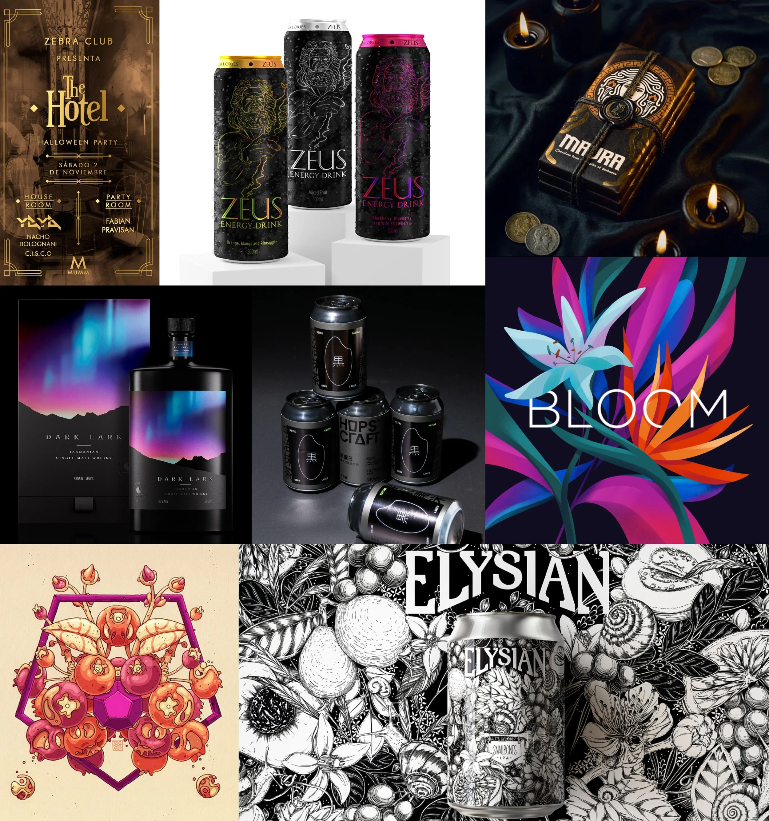
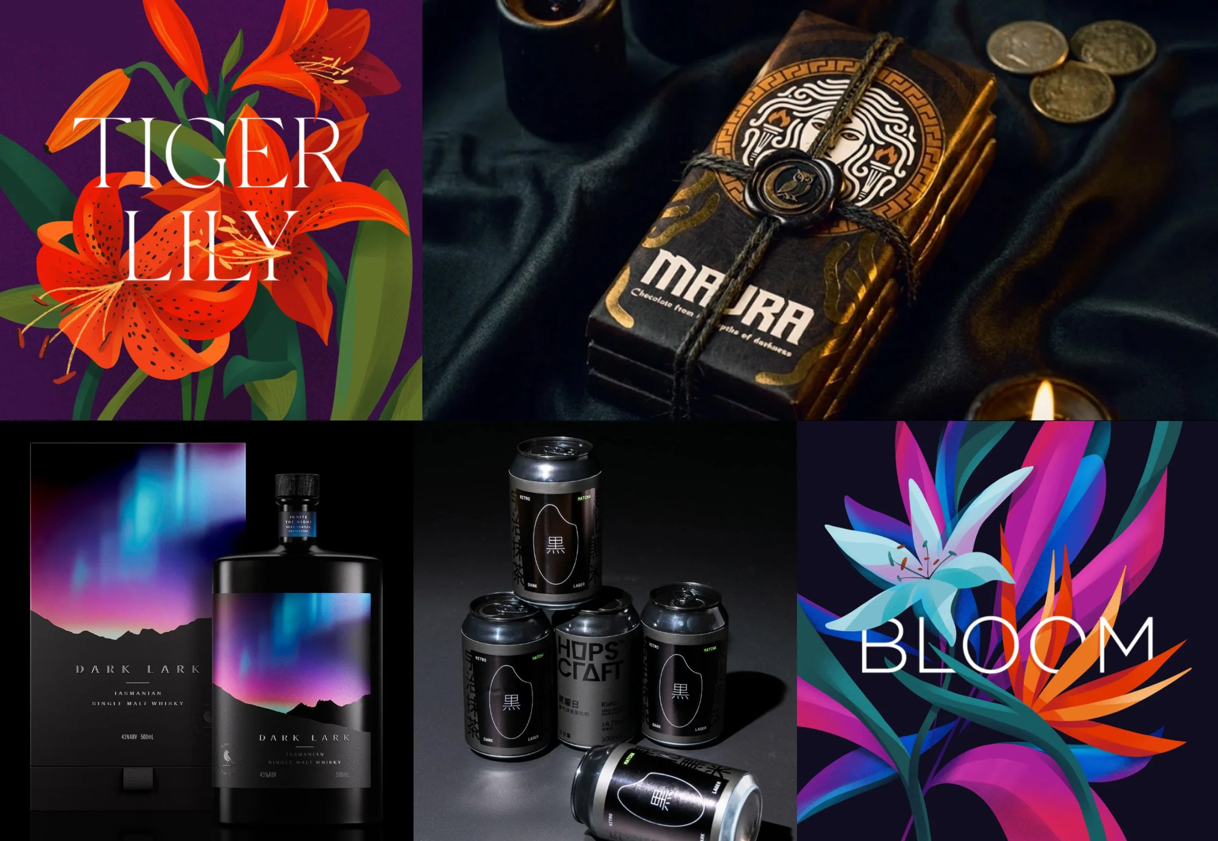
I started by casting a wide net—exploring references across craft beer, luxury spirits, and everything in between. My initial direction leaned heavily into illustration, which, while visually compelling, began to feel at odds with the quiet confidence Vesper needed to embody.
That realization forced a reset. It became an exercise in stepping back and asking harder questions, challenging my own instincts in favor of what the brand truly required. To exist in that “golden hour” space, the design couldn’t shout. It had to hold presence.
From there, the direction sharpened: stripping away complexity in favor of atmosphere, negative space, and controlled use of light. Gradients replaced illustration, creating depth without noise. The result is a visual language that feels restrained, intentional, and aligned with the Ethereal Noir aesthetic—premium, understated, and quietly magnetic.

Font Exploration
The brief called for “mysterious, evening elegance,” so the type couldn’t feel predictable. Serif made sense, but not the safe, editorial kind—I wanted something with character.
After a deep dive, I landed on Molten by Dazor. It has this smooth, almost creeping quality, like vines moving through shadow. Elegant, but a little dangerous. It felt right for a brand built around evening botanicals and that golden hour shift from calm to something more atmospheric.
Color Palette
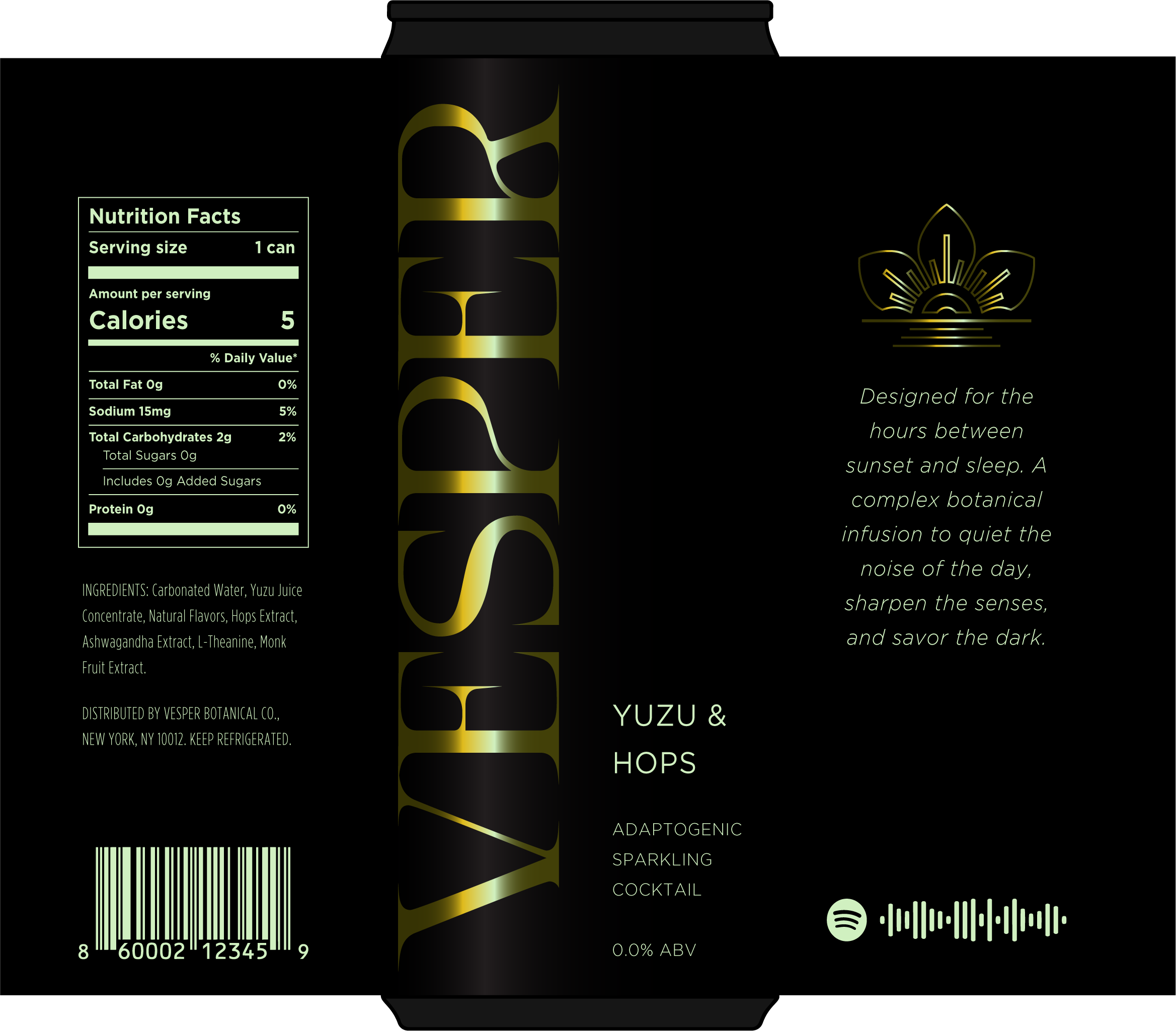
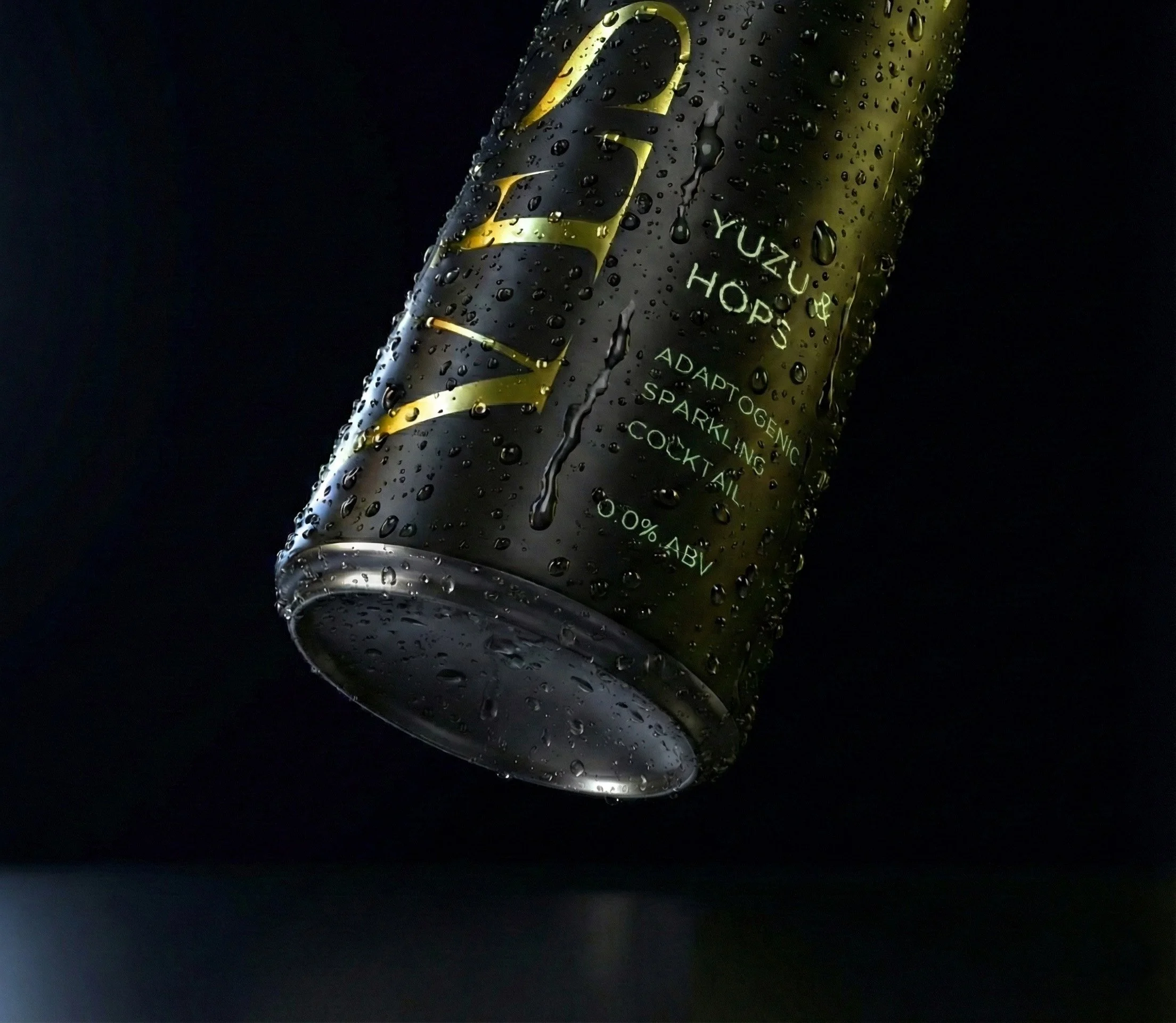
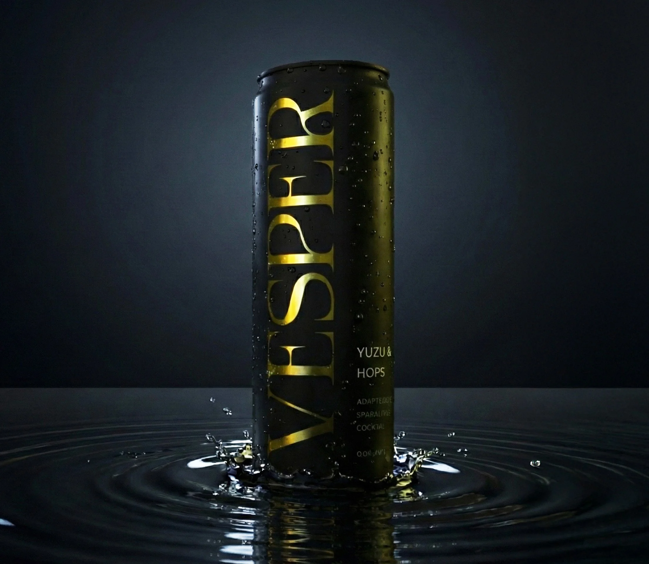
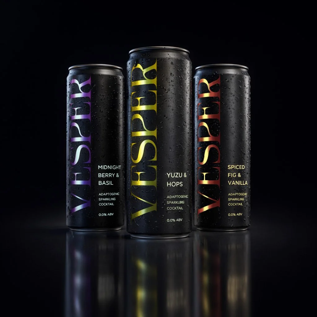
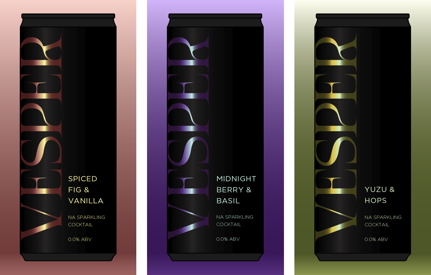
When designing Vesper, I wanted to capture the feeling of the "golden hour" without falling into the trap of looking like just another dark energy drink. My early drafts relied on bright, solid colors to signal flavor, but they felt too flat and "daytime" for the brand's nocturnal mystery. The breakthrough came when I swapped those flat inks for an iridescent foil on the logo, creating a shifting, metallic surface that mimics the complexity of the botanicals inside. To ground that ethereal shine, I wrapped the can in a deep, matte "Void Black," stripping away the noise of the grocery aisle.
The dark can, however, presented a legibility challenge in low light, so I introduced what I call "bioluminescent" pastels for the text. By using a sharp "Pale Tea" green (#d0f0c0) instead of standard white or gold, I ensured the legal copy "glowed" against the black aluminum. This created a scalable system where each flavor gets its own high-contrast pastel—Sage, Ice Mint, Cream—pairing the organic soul of the ingredients with the industrial precision of the can. The final result is a tactile balance of matte shadow and iridescent light.
Midnight Berry and Basil

Spiced Fig & Vanilla

Yuzu & Hops

Metallic Shift


Iridescent Shift


Putting the Pieces Together
With the direction locked, I jumped into Illustrator to build out mockups, my favorite phase, where the idea finally starts to breathe. Starting from the initial treatment, I refined the layout as I went. The descriptive text felt unanchored at first, so I tied it to the base of the “V” in Vesper to ground the composition. I then increased the supporting type from Light to Book, giving the flavor name the presence it needed.
Then it hit that moment every designer looks for—the point where everything clicks. The metallic gradients landed exactly as I had pictured, with the foil catching light and pulling the secondary flavor notes forward in subtle, shifting highlights. The interplay of negative space, restrained copy, and intentional use of color and texture allows the can to communicate premium luxury in the loudest whisper.

Wrapping the Can
Once the core visual language was in place, I began building out the rest of the can—thinking through how every element could contribute to the overall experience. Even the technical details were considered: nutrition facts set in a flavor-specific highlight color, subtly tying function back to the identity.
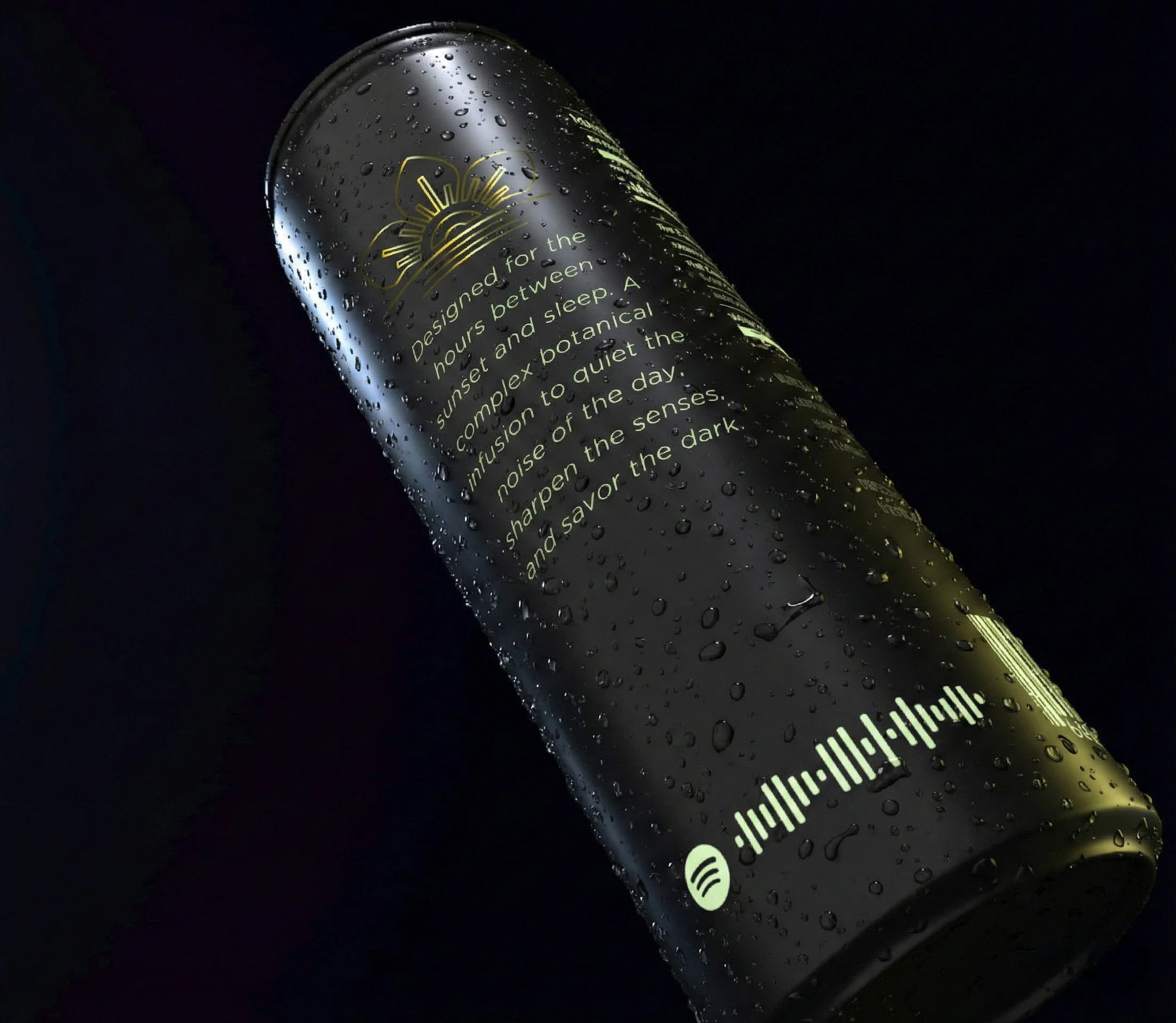
From there, I introduced a romance panel—something quiet and atmospheric, designed to give context without breaking the mood. But I wanted to push that idea further. The concept evolved into an experiential layer: a scannable Spotify code that links to a curated playlist, one that could shift and evolve over time—or even change depending on the flavor. It transforms the can from a static object into something more personal, inviting the consumer into a moment that extends beyond the drink itself.