

Project Statement
Showstopper Vintage was looking for a more complete visual toolkit to have for collaborating with vintage markets and developing in-house designs for packaging and web/social.
Logo Usage Guidelines
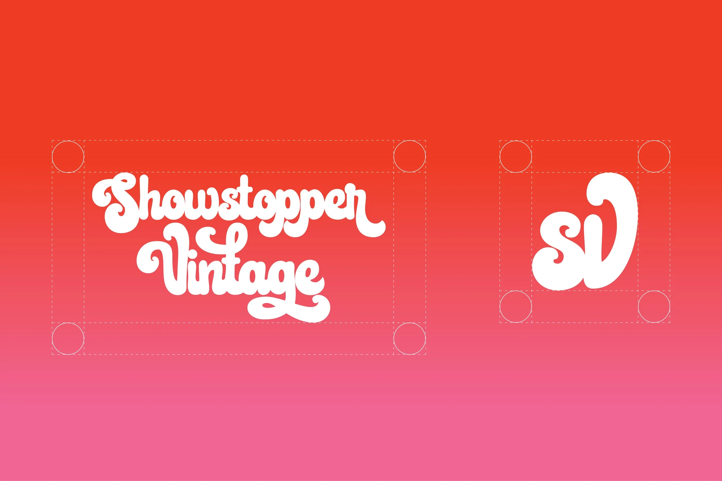
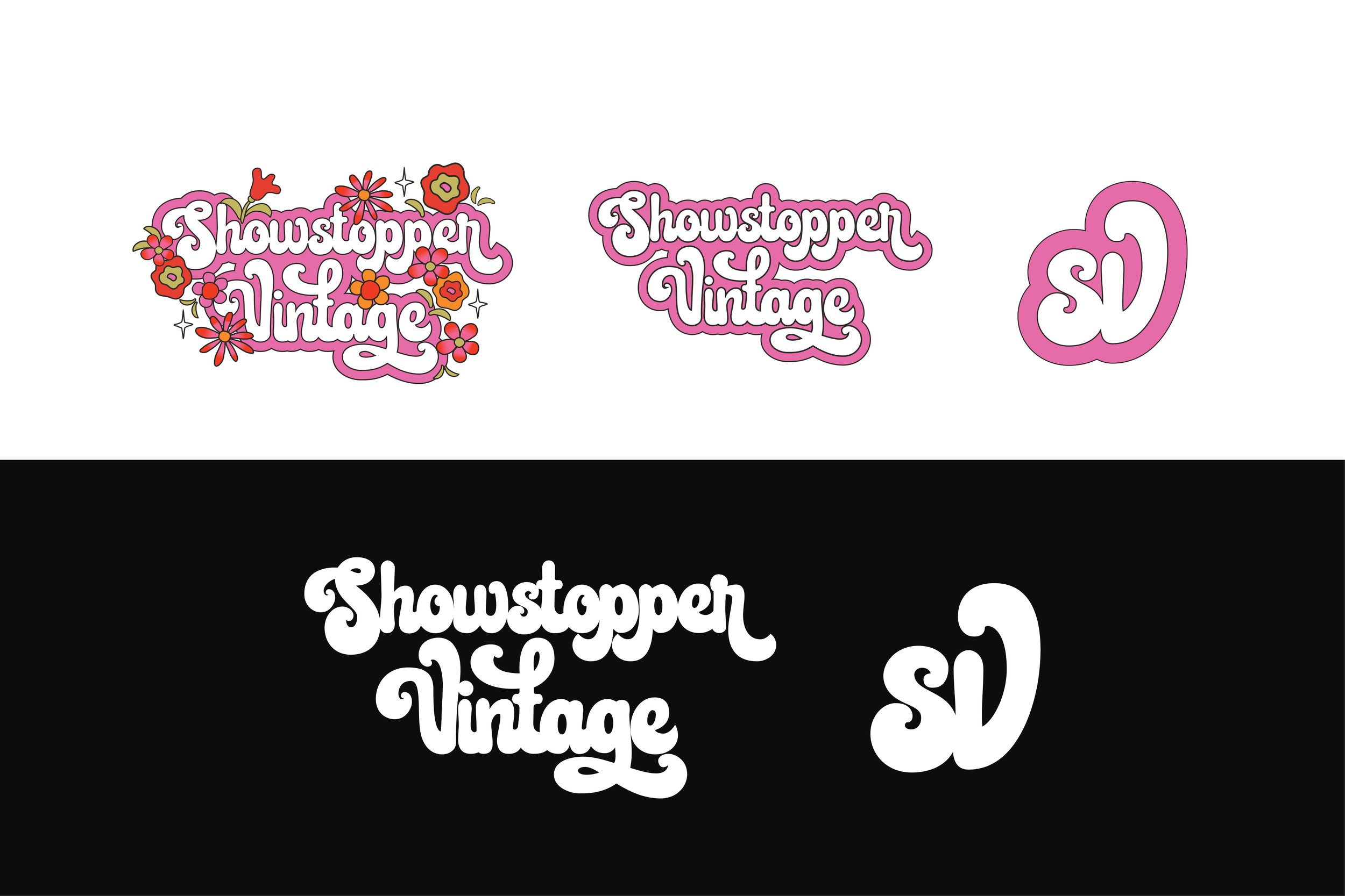
Showstopper had a logo, but not a system. I set out to create one, expanding the identity with simplified, reversed versions of the mark that hold up at a distance and across formats. The standout is the “SV” monogram, designed to work like a stamp: bold, repeatable, and versatile enough for everything from background overlays to bags and stickers. It transforms the logo from a single asset into a flexible toolkit that can live anywhere the brand shows up.

Color Palette
At its core, Showstopper is about showing up as yourself, and color is how it speaks. The palette leans into vivid, joyful tones like tangerine and electric pink, chosen not just for their energy but for what they represent: individuality, diversity, and inclusion. There’s a subtle 70s influence woven throughout—an era defined by bold expression and cultural shifts giving the brand a sense of warmth and familiarity. Together, the colors create a space that feels celebratory, human, and unmistakably alive.
Graphic Elements


Business Cards & Tags
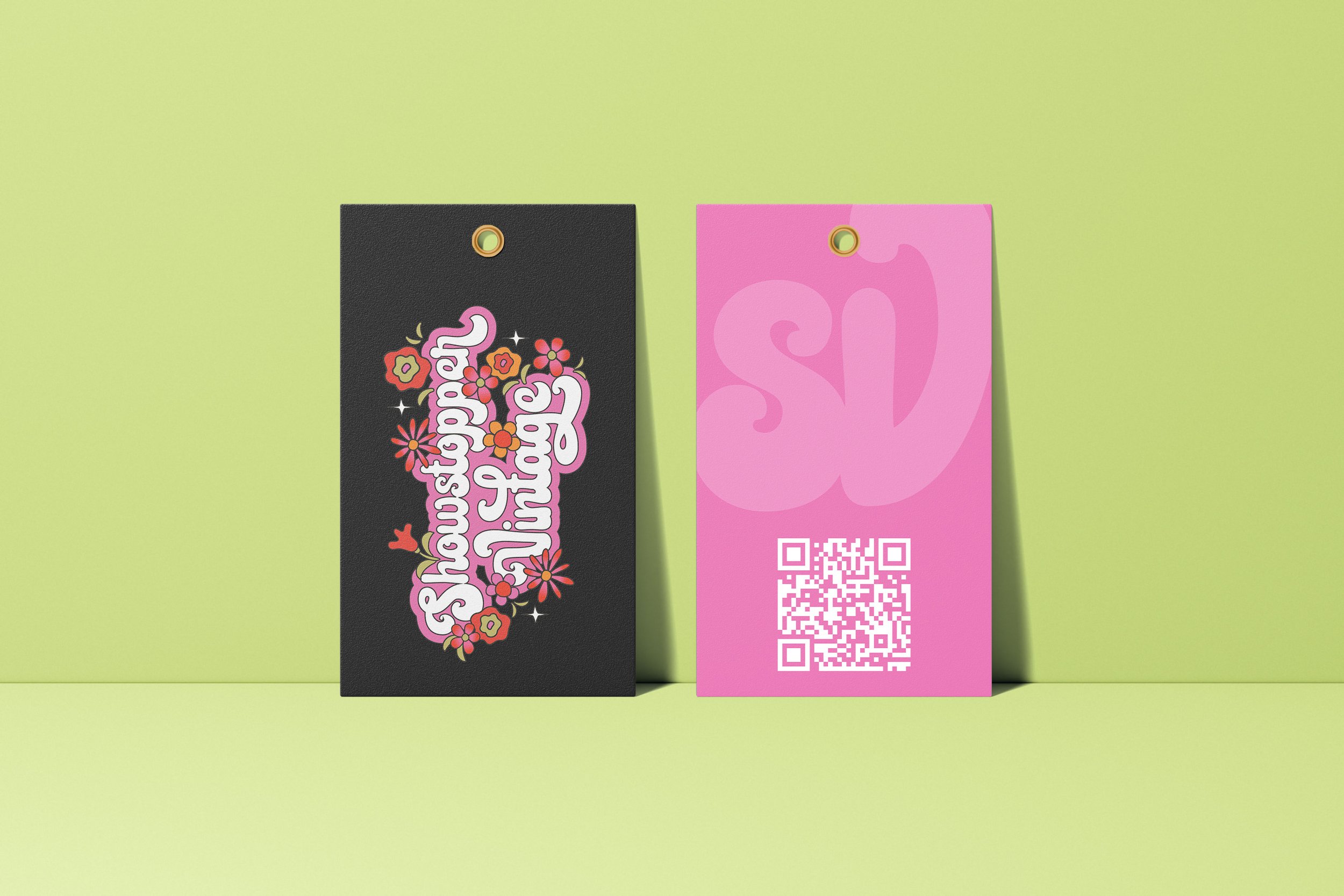
While revisiting the brand guidelines, I realized the founders’ business cards didn’t match where Showstopper was headed. Instead of a basic update, I used it as a chance to create something on-trend and unmistakably Showstopper. The redesign combines bold color, rounded corners, and a QR code that turns the card into a direct marketing touchpoint, while a portrait element adds a layer of personality and connection. That same system carries through to the merchandise tags, unifying brand and marketing in a single, expressive format.


Packaging
The lack of branded bags revealed a missed opportunity in the customer experience. Instead of just filling a functional need, I saw a chance to create something memorable. I designed a set of limited-edition bags for large market events, turning each purchase into a more immersive, shareable moment. The result was packaging that didn’t just carry product—it carried the brand, sparking conversation, building emotional connection, and driving word-of-mouth well beyond the booth.