

A Project Born of Love
As someone who visits the Minneapolis Institute of Art regularly, I started to notice a disconnect. The art is global, but the experience isn’t always. Limited language support on plaques and confusing, linear audio tours create barriers, especially for visitors who rely on accessibility features to fully engage.
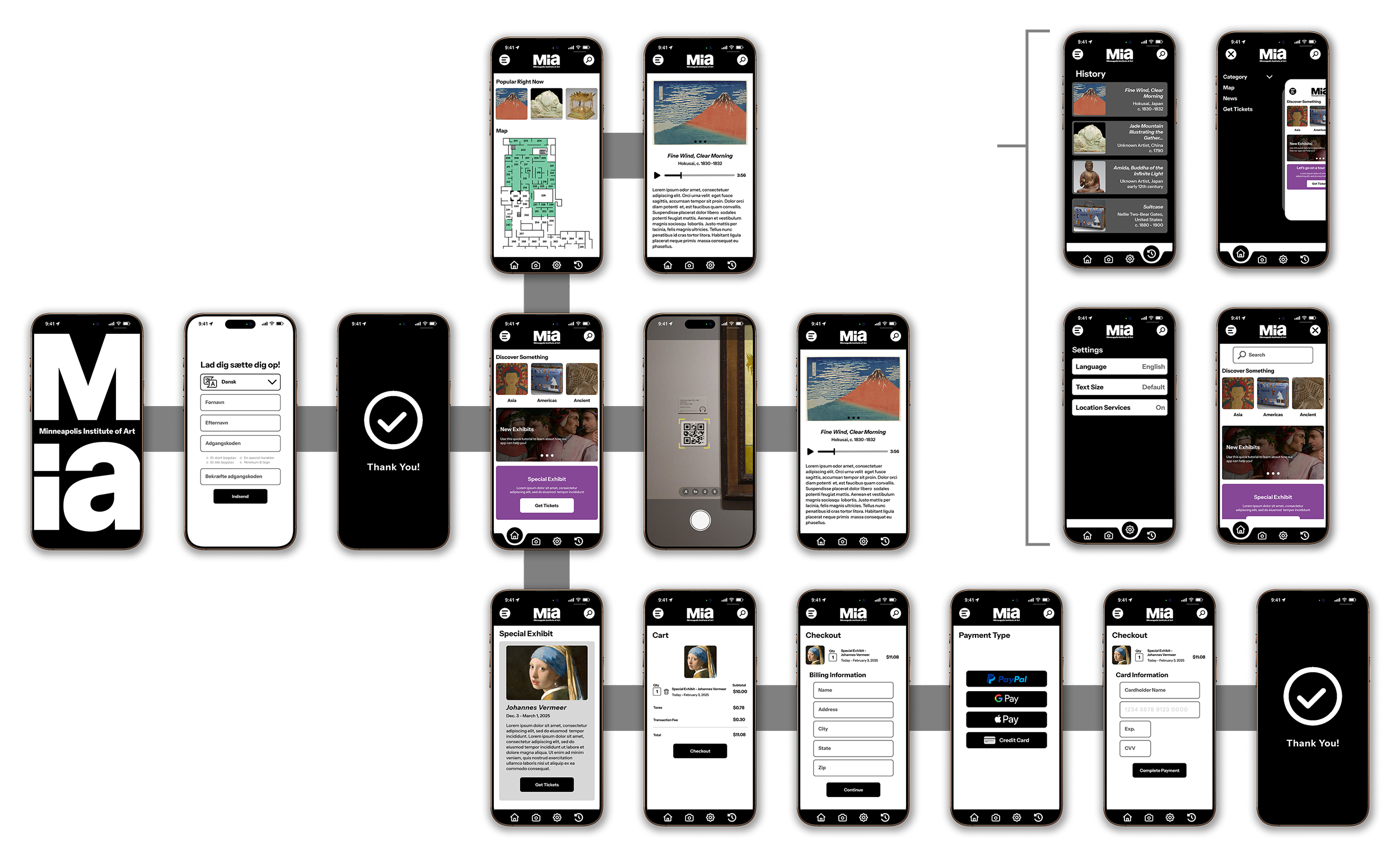
This project is my response to that gap. I set out to design a mobile experience that prioritizes accessibility from the ground up—audio tours with synchronized transcripts, multilingual support, and a clearer sense of spatial awareness within the gallery. It’s about removing friction and creating a more inclusive, self-guided experience that meets people where they are.
Storyboarding - Big Picture

Ken enters the museum. He’s having trouble navigating, and finding the pieces he wants to see and learn about.

He sees an advertisement for the museum’s app and decides to give it a try.
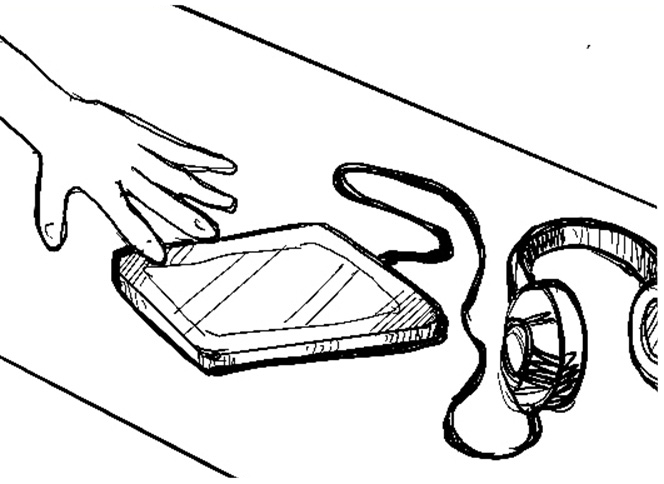
He decides to pick up the audio tour equipment, but it’s bulky and doesn’t provide much guidance.
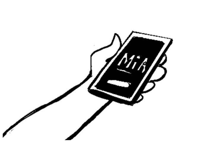
Ken then downloads and opens the app.
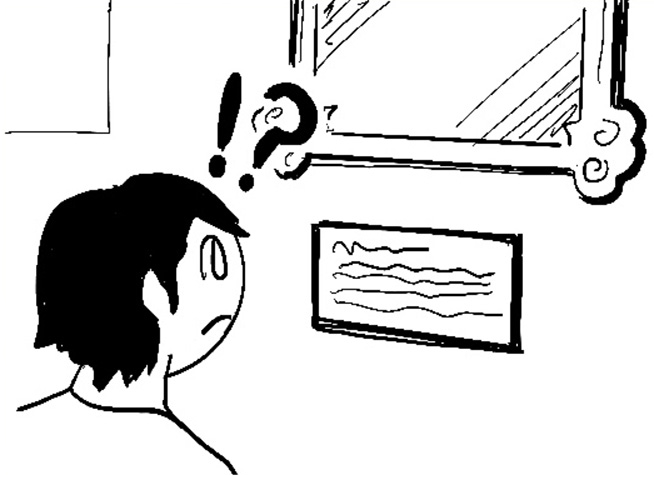
When he does find a piece, he notices the description plaque is limited and only in English.
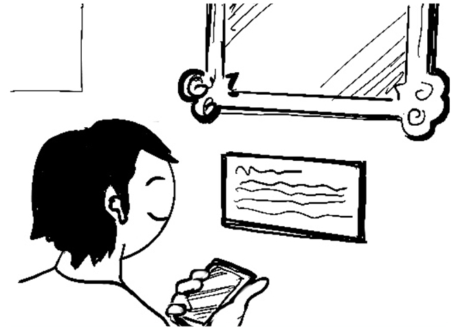
Within minutes, Ken navigating the museum and learning about the pieces he finds interesting.
Storyboards - Feature Specific
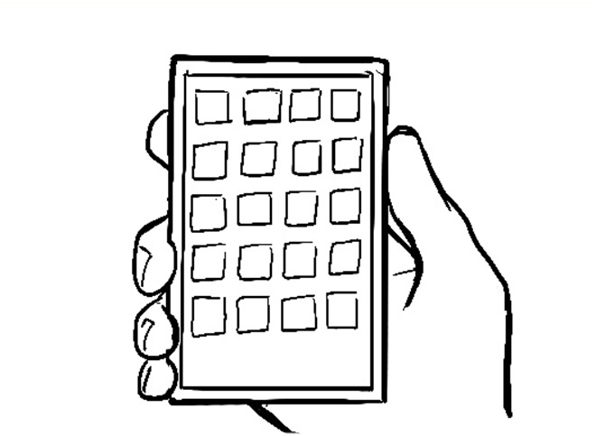
User finds the museum app and taps to open it.

User is taken to the homepage, user taps on the camera icon.

New user creates an account or existing user logs in.

User scans the QR code for the piece they want to see and learn about.

User chooses their preferred language for text and audio.
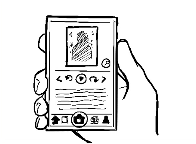
The user is taken to the artwork page which has a button to play audio, as well as the transcript of the audio.
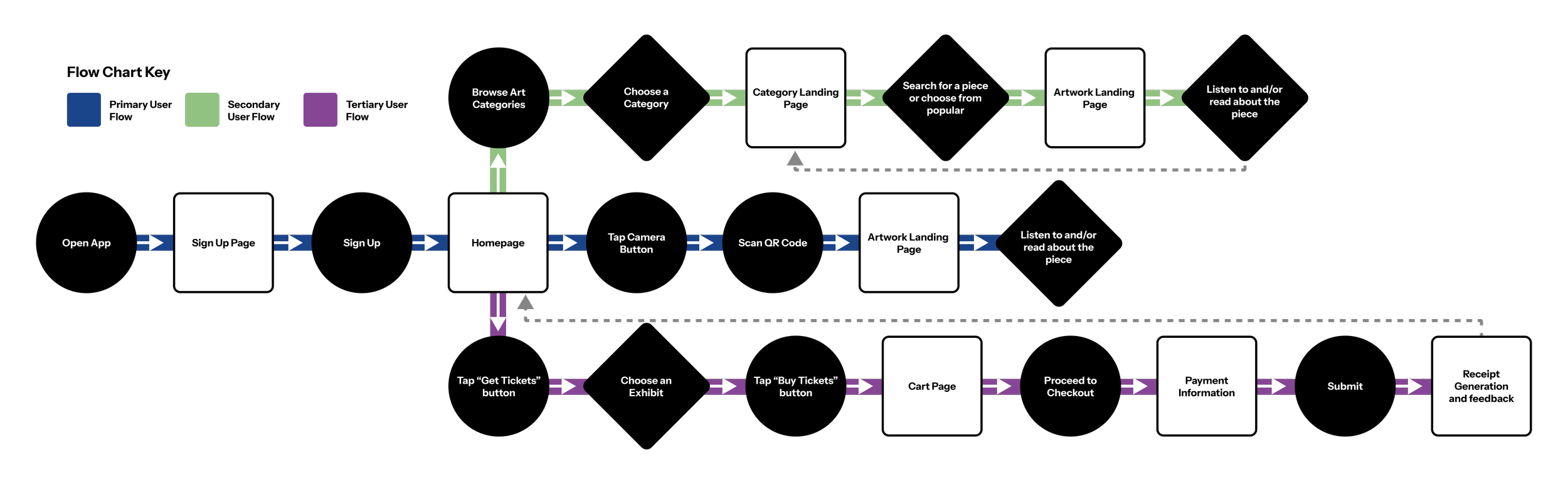
User Flow
In a museum, attention is split: you’re walking, observing, maybe holding a bag or a jacket, trying to stay present with the art. The digital experience shouldn’t compete with that, it should quietly support it.
This shaped the entire user flow. I focused on reducing effort at every step—making key information easy to access, easy to understand, and easy to return to. Accessibility became the core principle, not an add-on. Multilingual support with audio and read-along text, high-contrast visuals, larger type, and intuitive icons all work together to create an experience that feels inclusive, legible, and calm no matter how the user engages with it.
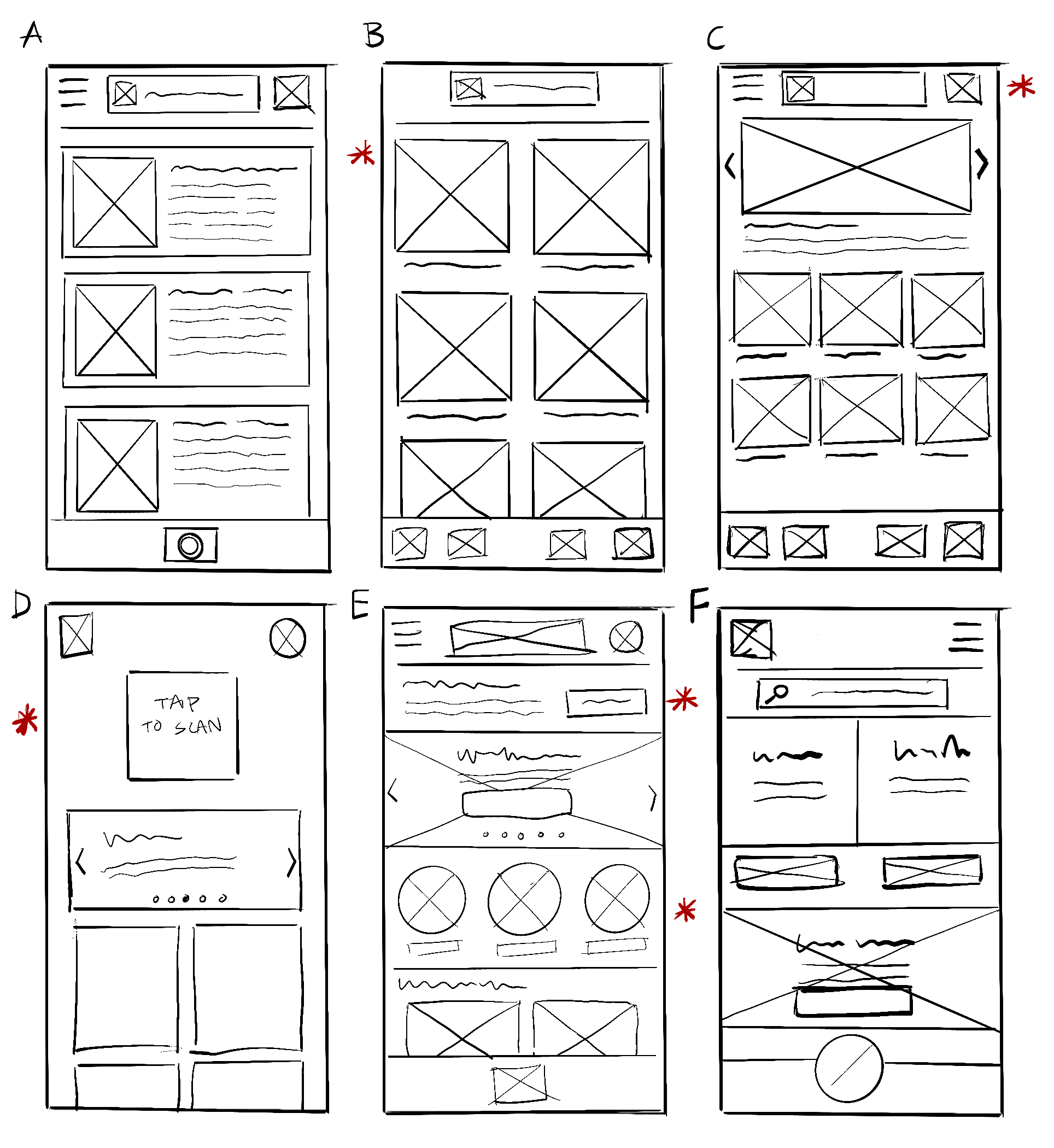
Wire Frames - Paper
Moving into the wire framing phase, I started by looking at a variety of apps I use regularly as reference. These apps were chosen based on their ease of use while being presented in a very visually digestible interface. I began to extrapolate their elements and start identifying layouts that would work well for the purpose of the app.
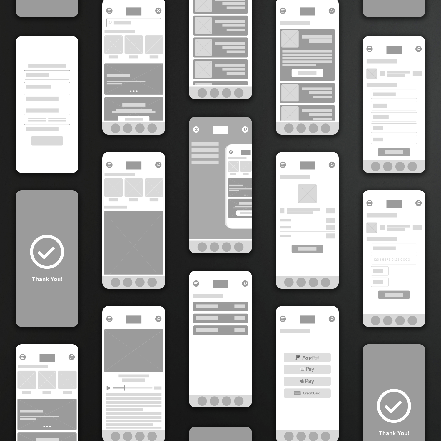
Wire Frames - Low Fidelity
As I worked through layout options, the designs began to shift. Each iteration uncovered new pain points and better ways to structure the experience. The goal became clear: simplify, reduce friction, and make the flow feel intuitive.
I also zoomed out to consider the bigger picture. If the app supports the museum experience, it shouldn’t stop at audio tours. That led to adding functionality like special exhibit ticketing, turning it into a more complete tool.
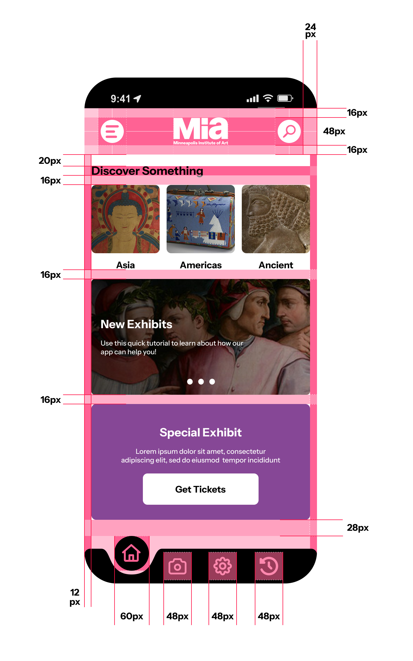
Page Structure
The app is designed with 4-pixel increments in mind, opting for a 12-pixel minimum. Primary buttons are set to 60px and secondary buttons at 48px.
Wire Frames - High Fidelity
High-fidelity is where everything gets real, and for this app, accessibility drives the design. I built a high-contrast system to ensure the interface stays legible in any environment, with typography that’s easy to read and quick to scan.
Buttons are sized and spaced for real use, with clear states and predictable behavior. Nothing relies on color alone to communicate. Every element is intentional, designed to reduce effort and make the experience feel straightforward for as many users as possible.